
An AI health product had a website nobody understood. The redesign was the easy part. The work was learning what the word "addiction" does to someone about to ask for help.
Some final screens are under NDA. The work shown here is concept and wireframe stage.

A colleague from my design academy introduced me to Curb.Health, an app that helps people manage alcohol cravings, combining AI with real clinical support.
The product was strong. The website wasn’t working.
They had a landing page collecting early sign-ups, and almost nobody was signing up. The traffic they did have came mostly from the founder’s own network, friends and family, not real demand. For a pre-launch product, that’s a serious problem: no early users means no evidence the thing is wanted.
The brief I was given: improve the onboarding.
What I found instead: the page didn’t have an onboarding problem. It had an identity problem.
I ran a competitive audit and a heuristic review of the existing site before touching anything. Three things stood out:
It was speaking to everyone, so it reached no one. The page tried to address people seeking help, clinicians, and employers all at once. Nothing was aimed at anybody.
You couldn’t tell what the product did. The copy was generic. The app’s actual functions and benefits weren’t visible.
It didn’t feel like a product. When we later tested the original site, one participant summed it up better than my whole audit had:
“It’s like a newsletter, more than a product.”

So the real question wasn’t “how do we improve onboarding.” It was: who is this for, and why would they trust it?
The client had research, but it was product-development data, gathered for building the app, not for understanding how someone arrives at a website in the first place.
I pushed for direct access to patients. That was not an easy conversation. We were asking a psychiatrist to let two designers speak to vulnerable people about the most difficult thing in their lives.
So we built the safeguards first.
Before we approached a single participant, we worked with the product owner, a practising psychiatrist, to establish a vetting and safeguarding process for the research. The specifics are covered by NDA, but the principle wasn’t complicated: people discussing the hardest thing in their lives deserve protection, and we weren’t going near them until that was in place. My colleague led on the methodology; I built the research strategy around it.
That work is the only reason we got access. It’s also the part of this project I’m proudest of, and the part I’d want any team hiring me to know about.
We focused on end users rather than clinicians or employers for the first round, including four former patients alongside people who’d never encountered the product. That mix mattered: former patients knew the journey, and unfamiliar participants showed us how the page actually reads to someone arriving cold.
Affinity Map
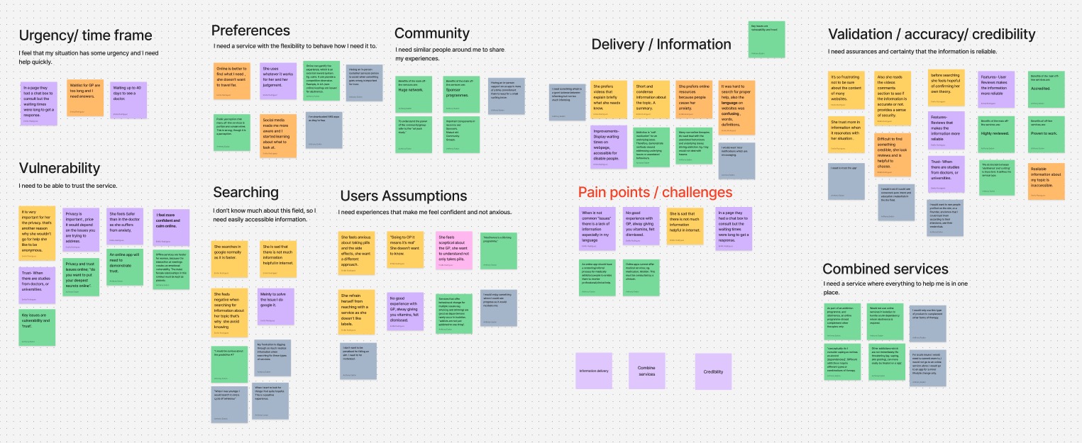

I expected to hear about features. I heard about shame.
“I almost lost my family and career because of my addiction — especially alcohol, which is so culturally acceptable and invisible at the same time.”
Three things came up again and again:
1. Labels stop people before they start.
Emma, 34, held back from reaching out for support because she didn’t want to be labelled. That’s not a copy preference. That’s someone not getting help because of a word.
2. The language of this industry is confusing and cold.
Mark, 45, described how hard it was to find proper help, the words and definitions on support websites made it harder, not easier. Stephen, 30, said that when your situation isn’t the “common” one, the information simply isn’t there.
3. Trust has to come before anything else is asked of you.
Susan, 37, was sceptical of the standard route, she didn’t want to just be handed pills, she wanted to understand what was happening to her. People here are making themselves vulnerable. Nothing works until they feel safe.

The moment that changed how I thought about the whole project: during one interview, a participant became very emotional. It was hard to stay composed. Until then I’d been treating addiction as the problem to design around. Watching her, I understood it differently, addiction is often a response to something deeper, and it can happen to anyone. That reframed every decision I made afterwards.
On the language decision: this wasn’t a copywriting flourish. Users who struggled with alcohol rejected “addict” and “addiction” because of what those words cost them socially and professionally. There’s also a lot of denial early on. “Cravings” describes something a person can accept and act on today. Reaching people mattered more than being clinically precise on a homepage.
On the trust signals: the credibility was already there, it just wasn’t visible. The product owner is a psychiatrist with years of clinical experience in addiction, and the company was backed by NHS Oxford University Hospital, the University of Cambridge Judge Business School, Barclays Eagle Labs, Innovate UK and The Hill. None of that was doing any work on the old page. Users had told us plainly that they needed proof of legitimacy before sharing anything, so I brought those signals forward and paired them with plain-language privacy wording, the answer to “can I trust you with this?” placed exactly where people were deciding.
On splitting the audiences: the decision was to stop asking one page to do three jobs. A clinician's questions are not an individual's, and neither of them is an employer's. Here is what that looked like once it was built.

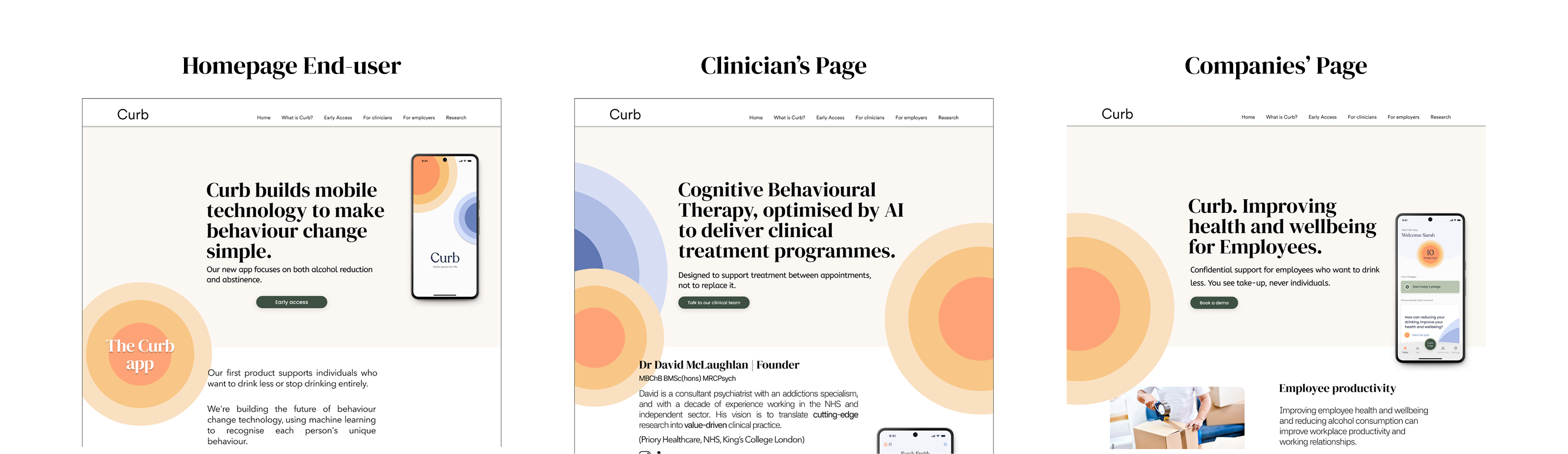
Mid-project, the client changed the scope. He’d originally wanted a single, minimal page for end users. Now he wanted clinicians and employers included too.
I argued for separate pages per audience. He wanted to keep it minimal and combined. We disagreed for a while.
Rather than keep debating, I built both and tested them.


Percentages shown are placeholder. The original site offered no supporting evidence at all, so part of the proposal was showing where credibility figures should sit once the client had them.
The users decided it. The separated version performed better, and I had evidence instead of an opinion. The client came on board, and the research also showed the multi-audience
approach made the site more credible to clinicians and employers, because it
addressed them on their own terms.
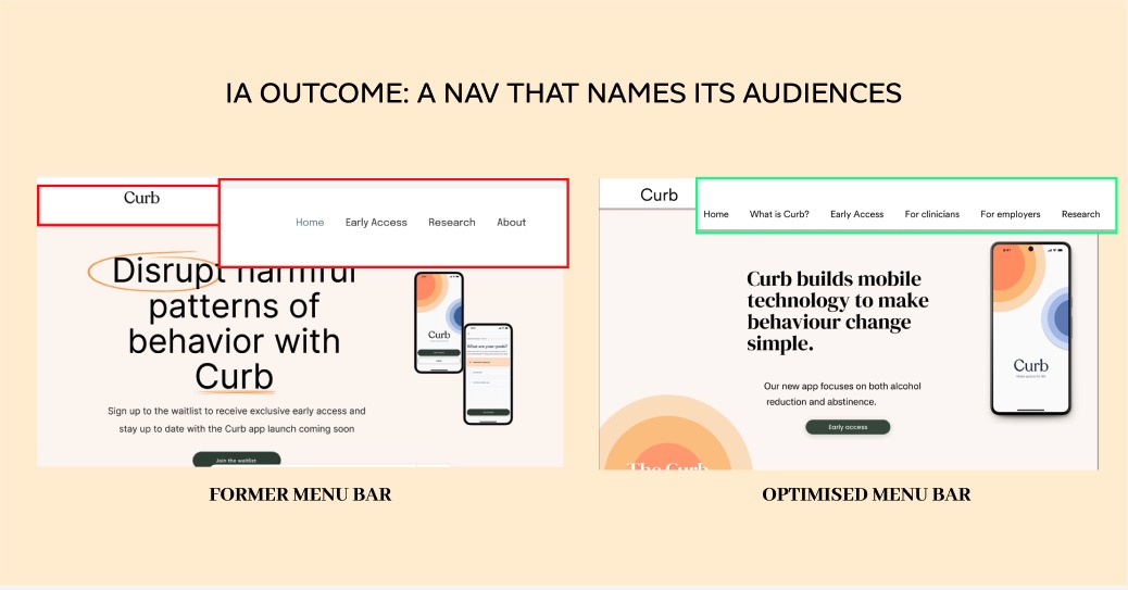
Four changes, each answering something users had told us:
And I got a version of the same lesson pointed back at me. My first mockup was too long, the client said so, and user testing agreed with him, not me. So I restructured it: instead of one long page, three shorter ones, each built around a single audience. He was right about the length; the research was right about the structure. Both things could be true.
We tested the existing site first to establish a baseline, then tested our design against it. Same tasks, same script, same conditions, so any difference could only come from the design.
How we ran it: two rounds, 20 participants each. For the second round I deliberately used a mix of returning and new participants, returning ones could tell us whether the changes actually fixed what they'd struggled with, and fresh eyes stopped us fooling ourselves with people who'd already learned the product.
We watched for four things: whether people could complete the core tasks, whether they could find what they were looking for, how long it took them to get there, and the one that mattered most, whether they understood what this product actually was.
People were confused within seconds. They didn’t engage with the content, scrolled without stopping, and couldn’t articulate what was being offered or who it was for. Several assumed it was a general information page rather than something they could sign up to.
This was where the "newsletter" comment came from, and it reframed the brief. We weren't fixing an onboarding flow. We were fixing the fact that nobody knew what they'd arrived at.
The change we cared about most was comprehension: people could now say, unprompted, what the product did and whether it was for them. Selecting their own path, individual, clinician, or employer, meant they stopped reading content aimed at someone else.
Task completion improved across the board. People found information without hunting for it, moved through the sign-up without hesitating, and importantly for this audience, the credibility and privacy signals landed at the moment people were deciding whether to trust us, rather than after.
The onboarding stopped being something people read, and became something they moved through.
On what I can and can’t claim. These are qualitative findings from my own moderated testing with 40 participants, not live analytics. The design was built, with some changes made by the client after handover, but I had no access to post-launch data and I’m not going to invent it. What I can stand behind is what I watched 40 people do, twice, under the same conditions. I’d rather show you evidence I gathered myself than a number I can’t source.
Test earlier and with even more people. We did a lot of research, but I’d front-load more of it, some of what we learned in round two would have saved rework if we’d known it in week one.
Design a more interactive onboarding. What we delivered was clear and calm. With more time I’d make the first-run experience more guided and responsive, rather than a page you read.
Words are interface. In a sensitive context, a single noun can be the difference between someone signing up and someone closing the tab. That’s true anywhere users feel exposed, health, money, legal, anything personal.
Trust is a design deliverable, not a brand adjective. Credibility signals, privacy language, and what you ask for and when, those are design decisions with measurable consequences.
Evidence ends arguments. The fastest way through a stakeholder disagreement wasn’t a better argument. It was building both versions and putting them in front of users.
Access is something you earn. We got to speak to vulnerable people because we built the safeguarding first. Doing the ethical work properly wasn’t a constraint on the research, it was the thing that made the research possible.
Credibility you don’t show doesn’t exist. This company had NHS and Cambridge backing and users still didn’t trust the page. Legitimacy has to be visible at the moment of doubt, not buried in an About page.
