Curb.Health is a pre-launch AI HealthTech platform designed to help individuals reduce alcohol-related harm using Just-in-Time Adaptive Interventions (JITAI). The platform serves three distinct audiences:
• Individuals seeking recovery support
• Clinicians monitoring patient progress
• Employers investing in workforce wellbeing
Prior to launch, the company needed to validate demand, establish product-market fit, and grow a high-quality waitlist to support future machine-learning model development.
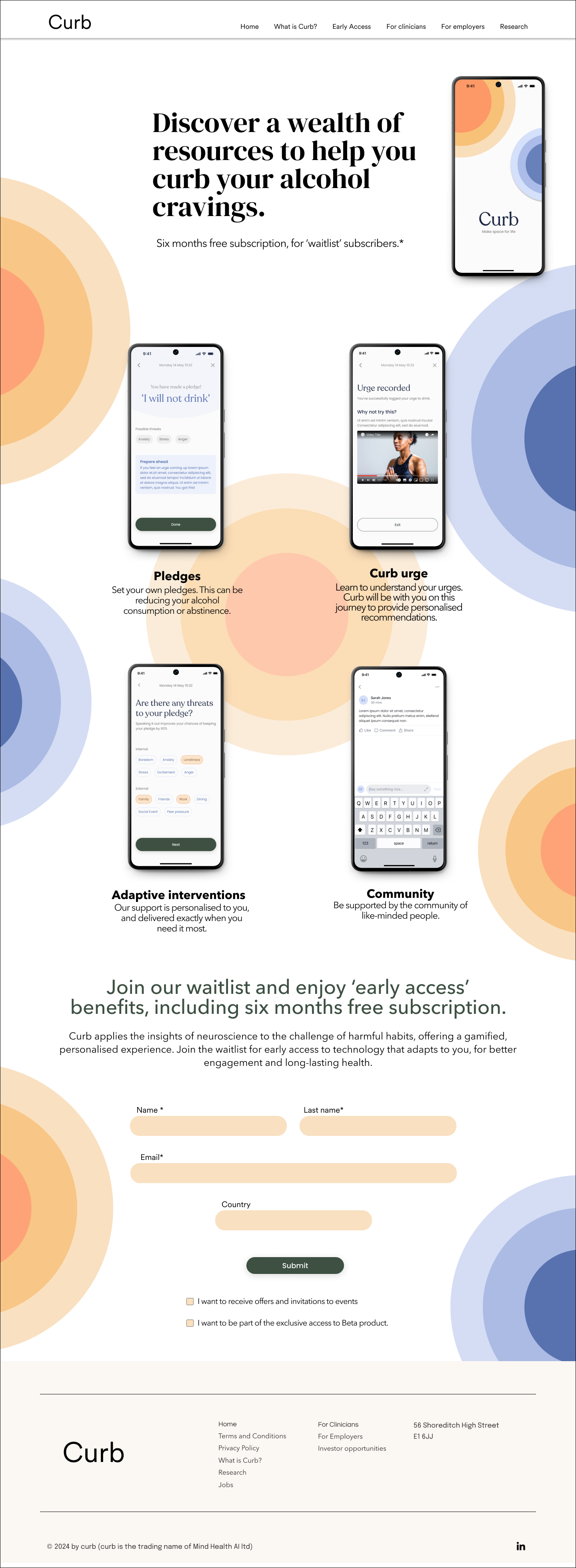
Early demand-generation efforts relied on a static landing page designed to collect waitlist sign-ups.
Initial performance revealed significant acquisition challenges:
• Visitors struggled to understand what the product did.
• Users could not determine which audience segment the platform served.
• Bounce rates on key pages were high.
• Waitlist conversion remained below expectations.
More importantly, the business faced a strategic risk:
Without acquiring enough early users, the company would lack the behavioural data required to train and refine future machine-learning models.
Transform the landing experience from an informational page into a scalable acquisition funnel capable of educating users and increasing sign-up intent.
Primary KPI
• Waitlist Conversion Rate
Secondary KPIs
• Engagement Depth
• Navigation Success Rate
• Bounce Rate
To understand user expectations, motivations, and barriers, I conducted a mixed-method research programme combining behavioural, attitudinal, and business insights.
• Stakeholder Workshops
• Analytics Review
• Heuristic Evaluation
• Competitive Analysis
• User Interviews (n=12)
• Moderated Usability Testing (n=18)
• Card Sorting
• Information Architecture Testing
Users could not quickly identify who the product was for.
The landing page attempted to address three audiences simultaneously, creating cognitive overload and reducing message clarity.
The language surrounding "addiction" generated emotional resistance.
Participants consistently responded more positively to language centred around "cravings", wellbeing, and support.
Trust was a prerequisite for engagement.
Because of the sensitive nature of alcohol-related behaviour, users required clear reassurance around confidentiality, credibility, and clinical oversight before sharing information.

This wasn’t just a UI issue—it was a failure of product positioning that threatened the company’s ability to seed its machine-learning model with real user data.
Users could not identify relevant content
Introduced persona-based navigation for Individuals, Clinicians, and Employers
Improved information findability
Users felt uncomfortable with addiction-focused language
Reframed messaging around cravings and wellbeing
Increased trust and engagement
Users required stronger credibility signals
Added clinical accreditation, privacy messaging, and support indicators
Reduced onboarding friction
Generic CTAs lacked clarity
Introduced persistent "Join the Waitlist" CTA
Increased conversion intent
I redesigned the onboarding experience around three principles:
Users self-selected their audience segment immediately upon entering the experience, allowing the platform to deliver tailored value propositions.
The interface incorporated:
• Clinical accreditation
• Plain-language AI explanations
• Confidentiality messaging
• Human support indicators
These interventions increased psychological safety during onboarding.
The onboarding flow was simplified into a single conversion path supported by:
• Persistent calls-to-action
• Reduced cognitive load
• Progressive disclosure
• Responsive mobile-first interactions
Two prototype directions were tested.
Incremental optimisation of the existing experience.
Persona-led navigation combined with tailored messaging and trust signals.
Moderated usability testing demonstrated that Prototype B:
• Enabled users to understand the product purpose twice as quickly.
• Increased confidence in platform credibility.
• Improved completion intent across all user groups.
As a result, Prototype B was selected for final delivery.
Waitlist Conversion
+40%
Engagement Depth
71%
Navigation Success
89%
Bounce Rate
-32%
Team Delivery Speed
+25%
Beyond conversion improvements, the redesign generated broader strategic value.
• Established a validated onboarding narrative for future product iterations.
• Created an analytics baseline for ongoing experimentation and growth optimisation.
• Increased investor confidence by demonstrating measurable traction prior to launch.
• Provided the business with an early user acquisition engine to support future AI model development.
For AI products, onboarding directly influences activation, data quality, retention, and long-term model performance.
In sensitive healthcare contexts, terminology significantly impacts trust, engagement, and conversion.
Embedding research and usability testing throughout the design process reduced risk and accelerated decision-making.
This project transformed Curb.Health's onboarding from a static marketing page into a measurable acquisition engine.More importantly, it demonstrated that in AI-driven healthcare, trust is not simply a UX principle—it is a business metric.